Key takeaways
- Export at about twice the display width, capped around 2000–2400 px for full-width banners.
- Use one aspect ratio per layout element so cards and galleries line up.
- WebP is a strong default for websites; JPEG for maximum compatibility; PNG for graphics.
- Quality 80–85 is a good starting point for photos.
- Use descriptive file names, meaningful alt text and width and height attributes.
Why image preparation matters
Large, unprepared images slow pages down, use visitors’ mobile data and can delay the moment the main content appears. Page speed affects how people experience a site, and search engines take user experience into account. The most common culprit is not the format but uploading camera-sized photos — 4000 to 6000 pixels wide — to show in a column that is 800 pixels wide.
The good news is that preparation is mostly mechanical: choose a size, a shape, a format and a quality, apply them to the whole set, and name the files properly.
Step 1: decide the display size
Find out how wide each image will appear on the page. Your theme or layout usually defines a content width. High-density screens use two device pixels per layout pixel, so a sensible export width is about twice the display width.
| Image role | Display width | Export width |
|---|---|---|
| Full-width hero | Up to about 1200–1440 px | 2000–2400 px |
| Article image | About 700–800 px | 1400–1600 px |
| Card or grid image | About 300–400 px | 600–800 px |
| Thumbnail or avatar | About 80–160 px | 160–320 px |
If you are unsure of the display width, right-click an existing image on your site and inspect it in your browser’s developer tools; the rendered size is shown there.
Step 2: crop to a consistent shape
Cards, galleries and listing pages look tidy when every image shares the same ratio. Choose the ratio before resizing:
- 16:9 for hero banners and video-style thumbnails.
- 3:2 or 4:3 for article images.
- 1:1 for products and avatars.
The crop and resize guide shows exactly how.
Step 3: choose the format
- WebP is a strong default for websites: all current major browsers display it and files are usually smaller than JPEG.
- JPEG for photos when your CMS or audience needs maximum compatibility.
- PNG for logos, icons, screenshots and anything with transparency or text.
Details are in JPEG vs PNG vs WebP.
Step 4: set quality
Start at 80–85 for JPEG or WebP, check the Result view and adjust. Hero images with skies or gradients may need 85–90 to avoid banding; busy textures tolerate lower values. The compression guide lists typical file-size targets.
Step 5: process the set in Pixcut
- Add the images to the Pixcut editor.
- Crop: choose the ratio for this set.
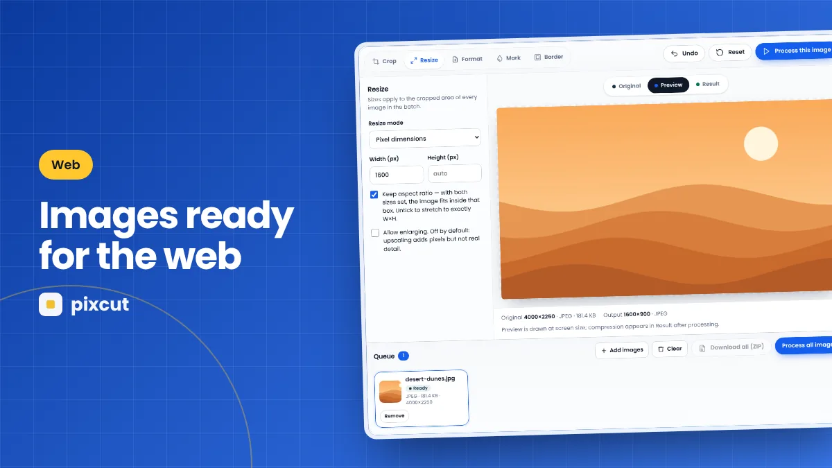
- Resize: Pixel dimensions, width set to your export width, height empty, Keep aspect ratio ticked.
- Format: WebP or JPEG at quality 82; set the suffix to something like
-web. - Press Process all images and download the ZIP.
Step 6: name and describe your files
File names
Use short, descriptive, lower-case names with hyphens: blue-trail-running-shoe.webp tells people and search engines far more than IMG_4821.webp. Rename files after downloading, or set a meaningful suffix in Pixcut and rename the base names in your file manager.
Alt text
Write alt text in your CMS that describes what the image shows and why it is there, as you would to someone who cannot see it. Purely decorative images can have empty alt text so screen readers skip them.
Dimensions and loading
- Set
widthandheightattributes (most CMSs do this automatically) so the page does not jump as images load. - Lazy-load images below the first screen, but not the main image at the top of the page.
- If your platform supports responsive images, upload a large version and let it generate smaller sizes.
A note on metadata and privacy
Photos from phones often contain EXIF data, including the date, camera model and sometimes GPS coordinates. Pixcut re-encodes images through a canvas, so exported files do not carry this metadata — useful before publishing personal photos. Colour profiles are not embedded either; for standard web images this is normal. See removing EXIF metadata for details.
Website image checklist
- Right width for its slot, doubled for high-density screens
- Consistent ratio within each layout element
- WebP or JPEG for photos, PNG for graphics
- Quality around 80–85
- Descriptive file name
- Meaningful alt text
- Width and height set; lazy-loading below the fold
Why image weight matters on mobile
Many visitors browse on phones over mobile connections that are slower and sometimes metered. A page that carries several megabytes of oversized images takes longer to become usable and can cost visitors real money in data. Preparing images properly is one of the simplest ways to make a site feel fast, and it benefits every visitor without any change to the design.
A worked example: a blog post with five photos
A blog theme has an 760-pixel content column and a 1440-pixel full-width header image.
- Header image: crop 16:9, resize to width 2400, WebP at 80, suffix
-hero. Result: 2400 × 1350. - Four in-article photos: choose Free crop to keep their natural shapes, resize to width 1520 (twice 760), WebP at 80, suffix
-post. - Download the ZIP, rename files descriptively, and upload them to the CMS.
- Write alt text for each image and let the CMS set width and height attributes.
Compared with uploading the original camera files, the page carries a small fraction of the image weight and looks identical to readers.
Image roles and the right preparation
| Image type | Format | Notes |
|---|---|---|
| Photographs | WebP or JPEG | Quality 80–85; resize to layout width × 2 |
| Logos | SVG on your site, PNG/WebP elsewhere | Keep transparency; Pixcut exports PNG and WebP |
| Screenshots | PNG or WebP | JPEG blurs text |
| Icons | SVG or PNG | Small files; avoid JPEG |
| Background images | WebP or JPEG | Can use lower quality (70–80) behind text |
Common website image mistakes
- Uploading originals straight from the camera. The CMS may resize them, but the original often stays on the server and can still be served.
- Using PNG for photos. Files become many times larger with no visible benefit.
- Missing alt text. Screen-reader users and search engines lose the image’s meaning.
- Lazy-loading the main image. It delays the most important picture on the page.
- Inconsistent shapes in card grids. Cards jump to different heights and the layout looks broken.
Glossary
- High-density (Retina) screen: a display with two or more device pixels per layout pixel.
- Lazy loading: delaying images until they are about to scroll into view.
- Responsive images: offering several sizes so each device downloads a suitable one.
- Alt text: a text description of an image for people who cannot see it.
Best practices
- Create a house standard. Write down widths, ratios, format and quality for each image role so everyone on the team exports the same way.
- Prepare before uploading. Resizing and compressing before upload avoids storing large originals on your server.
- Name files before they go live. Changing file names after publishing can break links and image search history.
- Write alt text as you upload. It is much easier to describe an image while you remember why you chose it.
- Review page weight regularly. Browser developer tools show how much each image weighs; check new pages occasionally.
Common questions
Should I upload one large image or several sizes?
If your CMS generates responsive sizes automatically (many do), upload one well-sized image around 2000–2400 pixels wide. Otherwise, export the exact sizes your layout needs.
Is WebP safe to use on my website?
All current major browsers display WebP. If you support very old browsers, keep JPEG fallbacks or use your CMS’s format handling.
How small should website images be?
There is no single rule, but many in-article photos land between 80 and 200 KB after resizing and compression. Compare quality, not just numbers.
Does Pixcut generate srcset sizes?
No. Export each size you need separately, or let your CMS generate responsive versions.
Should I remove EXIF data from website images?
Usually yes. It reduces size slightly and protects privacy. Pixcut’s exports do not contain EXIF data.
How many images should a page have?
As many as help the reader — but every image should be sized and compressed for its role.
Quick reference
- Width: about twice the display width, up to 2000–2400 px for banners
- Shape: one ratio per layout element
- Format: WebP or JPEG for photos, PNG for graphics
- Quality: around 80–85
- Finish: descriptive file names, alt text, width and height attributes
Summary
Preparing website images is a repeatable routine: choose the display width and double it, crop to a consistent ratio for each layout element, pick WebP or JPEG for photos and PNG for graphics, settle on a quality around 80–85, and finish with descriptive file names and alt text. Done once as a batch, it makes pages lighter, faster and more consistent. Write your standard down so every future upload follows the same rules.
Try it now — your images stay in your browser.
Open the Pixcut editor